
Photo by Andrew Ridley on Unsplash
Recently I was tasked with improving the existing search functionality of a web application, as part of a broader long-term effort to improve the overall user experience of the product.
The app in question is a Software-as-a-Service (SaaS) platform targeted to small businesses and medium enterprises. The specifics of the application are not relevant to this post; each client gets their own “portal” in our cloud-hosted environment and can manage users scoped to their organization.
The existing search functionality works exclusively as a way to find and navigate to the profile of other users in the portal. However, there were several drawbacks that customers complained about and that our product team recognized could be improved with redesign and re-implementation. Simply put, those were:
- Lack of flexibility. The logic for finding entries was straightforward and didn’t capture very common use cases. The search capabilities fell short of other products and did not meet user expectations.
- Lack of functionality. Much more could be baked into the search functionality. Not just finding users, but site navigation in general. It could and should be a feature capable of answering as many questions a user could have about the app.
- Outdated design. Since it was one of the first features ever built, its appearance did not match the design language used more recently elsewhere in the app.
- Performance. It was unacceptably slow and users noticed. Its speed was considerably slower than what one would expect for this type of feature.
The goal of the project was to address all those items and release a more intuitive and capable new search experience that users would want to use more often, reduce the number of support cases asking simple questions, and naturally help our customers be more productive on their own.
A complete rewrite made sense given the conditions, rather than a simple fix or changes on top of the existing code. Besides the user-facing goals of the project, this was also an opportunity for us to remove legacy code that relied on old client-side frameworks and libraries and replace it with a modern, thoroughly tested React component.
New Functionality
The app in question is large and complex. Over time, our team had received feedback about the difficulties users had navigating it.
At that point, the product team recognized that an improved search could help address those difficulties. The existing search functionality could only find other registered users in the portal, and users relied on it to navigate to their profiles. However, it was simplistic and not particularly helpful.
First, we improved the user search by factoring in some other data in the filtering logic instead of just the usernames or full names; like connections, identification numbers, and anything else that made sense that was associated with the user entity in the database.
Beyond that, we also enabled it to search through the entire sitemap so that results would appear when users searched for keywords related to specific pages or tools. If you searched for “settings”, a result for the Settings page would appear, and you could click it instead of relying on the regular navigation menu. This is valuable because some parts of the app are hard to find and deeply nested within other menus or routes.
To achieve this, we had to build a large object containing the necessary metadata for every route in the site. That metadata included properties such as the tool or page name, associated search keywords, and URL path. It also had to account for logged-in user permissions, since route visibility depends on a user’s role.
This object had to be manually crafted and maintained because the metadata could not be derived automatically. This meant that when adding new routes to the app, we had to remember to update that object; otherwise, the route would not appear in the new search tool.
To avoid this, I refactored the way our routes were defined throughout the app and created a single function that would return all the route definitions instead. I then added a check at the end of that function that would compare the collection of routes with the search tool metadata object. If there are any discrepancies, I render a full-screen error overlay in the app during development mode with instructions on how to proceed. It looks like this:
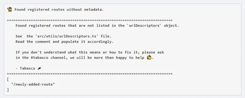
This was extremely important because four development teams, each with about five engineers, contributed to this repository daily in a fast-paced environment. Without an automatic way to keep it up to date, we would not have been able to keep the search tool working as expected over time. It is not feasible for me to review every pull request that is merged.
There were a few other things that the product team wanted to include in the search results that did not fit the “navigation” category. We have widgets such as real-time chat and help desk support that can be used anywhere. If we wanted to promote this new search tool as an all-in-one place to find everything users need, we had to include a way to trigger those widgets from it.
This was not particularly difficult, but the fact that search results could represent anything meant that the API design, filtering logic, and UI had to be flexible enough to support them. The possibility of adding different result types in the future also required careful consideration.
Another very subtle detail was added. At first, I did not think anything of it when I saw it on the designs, but it ended up becoming my overall favorite feature after implementation and release: a list of recently selected search results every time you focus the search input and open up the search panel. This can save the user many clicks and navigations, notably speeding-up the process of moving around the app. This alone accelerates productivity and enhances the user experience tremendously.
Improving user search performance
The existing search functionality was built using Backbone.js and relied on jQuery UI Autocomplete. Its UI did not look very different than the vanilla example hosted on that site. It had a “typeahead” or “autocomplete” behavior that would suggest entries to the user as they typed into the textbox. Those entries would be the names of other users in the portal.
Behind the scenes, the technical approach was the usual one for this type of component. A debounced change event listener triggers only after the user has stopped typing for a short interval chosen by the developer. When the debounce timer completes, a callback computes the suggestions. In this case, the callback was mostly an asynchronous network call to a server that queried a database and processed the input.
The debounce aspect is an optimization that aims to reduce the amount of unnecessary work as much as possible. It does not make much sense to compute suggestions for every single keystroke on the text input, since the user is most interested in those pertaining to the already complete or semi-complete search term.
What I have described so far is practically the de-facto way of building typeahead or autocomplete components and almost every site out there with a search functionality behaves this way.
The most sensible approach to improving performance is to optimize the server code that accesses the database and computes suggestions. After analyzing the endpoint, I noticed a lot of low-hanging fruit that would have a noticeable positive impact without much effort.
The endpoint in place was a general-purpose resource controller action used in several other parts of the application. It contained a lot of code that was irrelevant to search. As a result, execution took longer, and the server returned a much larger payload than necessary because it contained excessive data that the search did not use. This led to a longer network round-trip and a higher memory footprint.
Let’s look at some real production metrics:

(min: 158.21ms, max: 9.95s, avg: 562.47ms)
This shows the duration of network round-trips for this endpoint when used specifically for the legacy search functionality. The unusual random peaks obfuscate the visual information a little bit. I tried to find a significant period that did not have one but could not, so left it in as it represents the real nature of the behavior of the endpoint anyway.
We can focus on the averages and minimums. Even when looking at longer periods, the average of ~500ms (half a second) is maintained. However, the reality is that the performance differs per portal.
Organizations with fewer users experienced durations much closer to the 150-200 ms minimum, whereas our largest portals experienced a consistent 1 to 1.1 seconds, with occasional peaks of up to 5 or 10 seconds.
So, if you are unlucky enough to be part of one of the biggest organizations, you would have to wait at a minimum 1.5 seconds before the search displayed suggestions when we account for the debounce time and DOM rendering duration in the browser. This would be an awful user experience.
Generally, I am a huge advocate for standard, spec-compliant RESTful APIs and against single-purpose endpoints in most cases. For this scenario, however, a single-purpose endpoint made technical sense given the constraints, the goal, and the return on investment.
If we created a new endpoint that did and returned only the bare minimum, the same metrics would look considerably different. We discussed this with the rest of the development team, and everyone agreed. We had a plan to move forward.
Nevertheless, after sleeping on it, it occurred to me that client-side filtering could yield dramatically better performance for our particular case. The number of records to search for each portal was on the order of thousands, even in the worst-case scenario, rather than millions.
In other words, if you have to perform a search over millions and millions of records, without a doubt you need to execute this logic on the server and have an optimized database or search engine to do that heavy lifting. But if you are only searching through hundreds or thousands of records, up to a certain limit it makes sense to not involve a server at all and let the user’s device do it.
This is our case because our haystack is the users that belong to a certain organization, and not only do we know exactly that number, we also have an established business target that caps that number to a limit that we control.
With that hypothesis in place, I needed to confirm that it was indeed a good idea. Using this approach would mean that we would have to return a payload to the browser with a set of ALL users registered so that when they used the search bar, we already had them in memory and ready to be filtered through. This brings up a few questions that would concern any experienced front-end engineer:
- What would the total size of that payload be?
- How long would it take to download that payload?
- Are there significant memory implications of having this big data set in the browser instance?
- When performing the search, wouldn’t this heavy computation of filtering through thousands of array items in the client potentially freeze the browser’s tab?
- How fast can the browser filter through thousands of records?
To make a technical decision, we also need to consider business variables. When sizing a solution, it is wise to discuss worst-case scenarios, such as the payload size for our theoretically largest portal. However, that scenario might represent only 0.01% or less of the user population, while the 99th percentile could have much more reasonable numbers.
Take payload download duration, for instance. It is true that under a 2G/EDGE or low bandwidth connection this approach could fail to meet an acceptable user experience when the haystack is big enough but is it not true that every application out there is meant to or will be used with this type of connection.
This is where having good, reliable data about your users and business audience pays off. For example, it makes no sense to rule out a technical solution because it does not work on low-end mobile devices if none of your users rely on mobile to access the application. I believe this is where many optimization-oriented engineers drop the ball: they fail to recognize or account for their users’ demographics.
With this in mind, I turned to our analytics and databases to gather the information necessary to answer the questions above using meaningful percentiles. In other words, what would the answer be for 80%, 90%, 95%, 99%, and 99.5% of our users? With this data, I put together low-effort proofs of concept in our test environments to illustrate the problem in practice and started experimenting.
The results were extremely positive. The browser was much faster than I had anticipated even in environments of low computational power, and I started to get excited at how much of a perceived difference it would be in the user experience after we completed the project. It was time to start building the real thing.
Typeahead component
In the legacy implementation, I mentioned that jQuery UI’s Autocomplete plugin was used in a component built with Backbone.js. For the new version, we wanted to rewrite it in React. We could have still relied on jQuery UI, but the plugin itself had a few race conditions, so it was not perfect by any means.
We also wanted more flexibility and potentially remove any jQuery dependency in the app altogether in the future, so parting ways, and doing it from scratch was a better option. Thanks to the ergonomic design of React’s API it is not that hard to build an autocomplete or typeahead anyway, so it was a no-brainer.
The component can be summarized as “a textbox that displays suggestions to the user as they type in it”. As for technical acceptance criteria, we can establish:
- The suggestions are not computed on every keystroke.
- The suggestions should be computed after the user has stopped typing.
- Should be fast.
- If there are more suggestions than what can be displayed, the suggestions panel should be scrollable.
- Should support mouse and keyboard interactions.
- Arrow keys highlight the suggestion below or above.
- Home and end keys take the user to the first or last suggestion result.
- Page up and down keys scroll the suggestions panel.
- Mouse wheel scrolls the suggestions panel.
- Enter key on a highlighted suggestion selects it.
- Escape key closes the suggestions panel and clears the input text.
- Should be fully accessible and conform to the “listbox” role requirements as established by the Accessible Rich Internet Applications (WAI-ARIA) 1.1 specification (see https://www.w3.org/TR/wai-aria-1.1/#listbox and https://www.w3.org/TR/wai-aria-practices-1.1/#Listbox).
Given the asynchronous nature of input interactions and suggestion computation, the Observer pattern fits the problem domain well, so I built a solution using RxJS. Its value becomes clearer when you compare code that achieves the same visible behavior with and without it.
This is not meant to be an RxJS tutorial so I will not spend too much time focusing on the reactive details. A simple version of the subscription that achieves what we want could look like this:
import { BehaviorSubject } from 'rxjs'import {  debounceTime,  distinctUntilChanged,  filter,  switchMap,  retry,} from 'rxjs/operators'
import { computeSuggestions } from './computeSuggestions'
const minLength = 2const debounceDueTime = 200const behaviorSubject = new BehaviorSubject('')
// ...
const subscription = behaviorSubject  .pipe(    debounceTime(debounceDueTime),    distinctUntilChanged(),    filter((query: string) => query.length >= minLength),    switchMap((query: string, _: number) => {      return computeSuggestions(query)    }),    retry(0),  )  .subscribe(    (value) => {      // set suggestions    },    (error) => {      // handle errors    },  )
// ...
input.addEventListener('click', (e) => {  behaviorSubject.next(e.currentTarget.value)})
If we pass the input value to the behaviorSubject every time the input changes, the piped operators guarantee that the first callback passed to .subscribe() executes if:
a) the value is 2 or more characters long, b) the user has stopped typing for 200 milliseconds, and c) the last value that triggered the callback execution is not the same as the current one.
This could be easily integrated into a React component, giving us an elegant and concise way to handle the stream of input change events required for our typeahead. Add the keyboard event-handling logic, and we have all we need.
However, we can offer a more flexible solution by packaging this into a “headless” React hook with no UI concerns and shifting that responsibility to the consumer. This achieves a true separation between logic and view, allowing us to reuse the hook without changes regardless of the design we need to follow.
Blocking the Main Thread
JavaScript is a single-threaded programming language. Filtering in the browser instead of on the server means that the computation would no longer be asynchronous.
This is problematic because, while JavaScript is busy running our filtering logic and iterating through thousands of items, the browser cannot do anything else, resulting in a frozen tab. In this scenario, many interactions, such as JavaScript-based animations, typing in inputs, and selecting text, become completely unresponsive. You have most likely experienced this before; we usually refer to it as “blocking the main thread.”
MDN has a much better definition of what’s going on:
The main thread is where a browser processes user events and paints. By default, the browser uses a single thread to run all the JavaScript on your page, as well as to perform layout, reflows, and garbage collection. This means that long-running JavaScript functions can block the thread, leading to an unresponsive page and a bad user experience.
Thankfully, the browser is extremely fast. Even when filtering through thousands of records, it takes only a few dozen milliseconds at worst on mid-range devices, which is not long enough for a user to notice frozen or blocked behavior.
I still wanted to avoid blocking the main thread if possible. Thankfully, that is possible by using a browser feature called “Web Workers.”
Web Workers have been around for over 10 years but, for some reason, have not yet become mainstream. I blame it on how difficult they are to ergonomically integrate into your development and deployment flow. If you haven’t heard of them, they’re essentially an escape hatch that browsers provide to run code in a separate thread from the main thread, preventing blocking. There are certain caveats to using them but nothing that represented a deal-breaker for my use-case. The only real challenge was being able to integrate them seamlessly into our architecture and build setup.
Web Workers are somewhat awkward to use because you must pass a path to the JavaScript file containing threaded code, then use asynchronous messages to pass information back and forth.
const worker = new Worker('../my-worker-file.js')
worker.postMessage('hello world')onmessage = function (msg) { console.log(msg)}Like any modern large-scale single-page application, we bundle all our code into a few processed files that we statically serve to the browser at runtime. There is therefore never a one-to-one relationship between a source file and the file served to a user. Although our repository might contain src/my-worker-file.js, that does not mean a server will host my-worker-file.js; it will be packaged into the production bundle with the rest of the codebase.
We could opt not to bundle it and serve it directly as-is so that the code snippet above would work. However, we would have to edit the bundling configuration manually whenever we renamed, added, or removed worker files. This also risks a compile-time disconnect between the main-thread code and those files. We would have to keep these changes in sync manually, without automated help from the build tooling. This is brittle and creates a poor developer experience.
Ideally, I wanted an abstraction that allowed us to instantiate Web Workers anywhere in the codebase without updating bundling configuration, while still using dependencies, sharing code across threads, and retaining compile-time checks such as linting, import and export checks, and type safety.
The goal would be to have something similar to this work as expected, even when bundling is involved:
import worker from '../my-worker-file'
worker.postMessage('hello world')onmessage = function (msg) { console.log(msg)}Of course, one can build tooling to achieve this, but there are great ones already available in the community, like Comlink by Surma and Workerize by Jason Miller.
I used workerize because it fit my use case better and, along with workerize-loader, provided exactly what I wanted and more. I replicated the configuration used in this minimal setup repository, which includes test setups for both Jest and Mocha: https://github.com/reyronald/minimal-workerize-setup.
You can see an online demo here, which also clearly demonstrates the main-thread problem described above.
| No web worker | Using web worker |
|---|---|
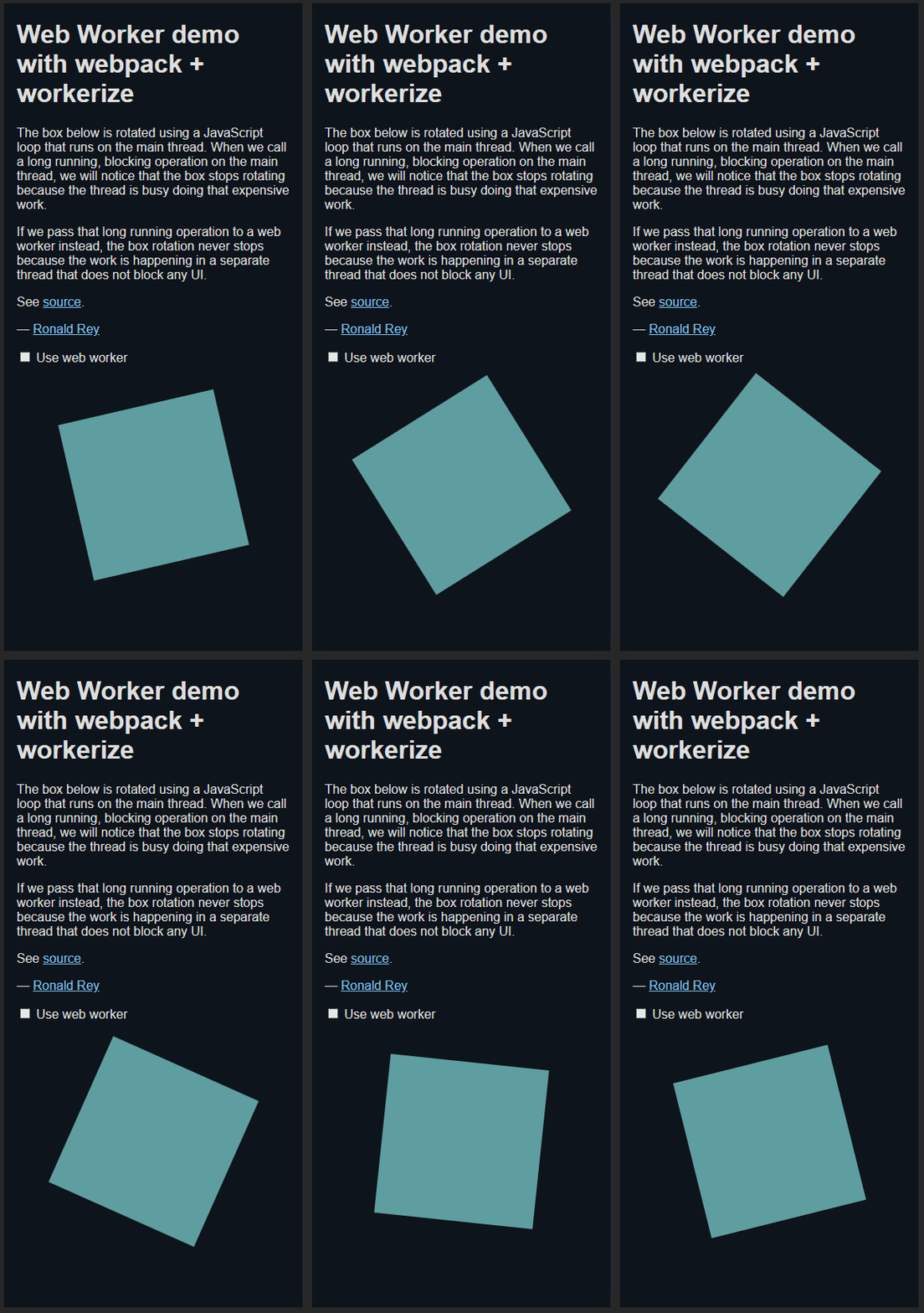 | 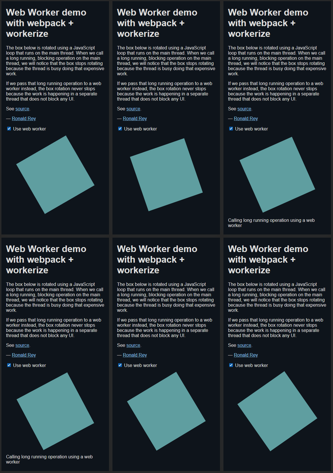 |
I used that same setup and put the filtering logic in a separate thread, which guaranteed the browser’s responsiveness even when the CPU was heavily throttled.
There is another part of the setup in the sample repository that I want to highlight. While working on this part of the project, I started thinking about other places in the app that could benefit from moving code to a separate thread. I did not want to spawn a new thread for every piece of logic because multiple workers could be needed on the same page.
Instead, I wanted a simple, easy-to-use mechanism for sharing Web Worker instances across the application while ensuring they were terminated when no longer needed. This is the API I chose:
function ComponentA() {  const [    requestWorkerInstance,    releaseWorkerInstance,    getWorkerInstance,  ] = workerManager()
  React.useEffect(() => {    requestWorkerInstance()    return () => {      releaseWorkerInstance()    }  }, [requestWorkerInstance, releaseWorkerInstance])
  // ...
  const instance = getWorkerInstance()
  instance.doSomeHeavyAsyncWork()}
In any component, you can get an instance of a single Web Worker thread by calling getWorkerInstance(). However, you must first call requestWorkerInstance() so that a new worker is spawned if one does not yet exist. If one is already available, you receive that instance instead.
When you no longer need access to the thread, call releaseWorkerInstance(). It terminates the worker as long as no other consumer depends on it.
The references to requestWorkerInstance and releaseWorkerInstance never change, so it is safe to include them as React.useEffect dependencies. This makes the system easy to integrate into any component. The most common flow is to request an instance when the component mounts and release it when it unmounts.
Internally, those functions track how many consumers depend on those instances at any given time so they know when to instantiate a new worker or terminate the current one. It is the singleton pattern applied to Web Worker threads.
The “worker manager“‘s code is very simple and looks a little bit like this:
import workerizeFactory from './my-worker.worker'
let instancelet instanceCreated = falselet consumers = 0
const requestInstance = () => {  if (!instanceCreated) {    instance = workerizeFactory()    instanceCreated = true  }
  consumers++}
const releaseInstance = () => {  if (--consumers === 0) {    instance.terminate()    instanceCreated = false  }}
const getWorkerInstance = () => instance
export function workerManager() {  return [requestInstance, releaseInstance, getWorkerInstance]}
The actual version that I used is a little more complicated to accommodate for correct and proper type checks with TypeScript. You can see the full version in the CodeSandbox and repo posted above.
Smart Search logic
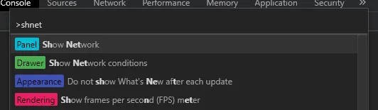
I mentioned earlier that we wanted this new search to be more flexible and smarter. I thought it would be cool if the matching algorithm worked similarly to other tools developers use every day. I am talking about the approximate, or fuzzy, matching built into the navigation search bars of apps such as VS Code, Sublime Text, and Chrome DevTools.
If you are not familiar, the logic will match any results that have the same input characters in the same order of appearance, but without the requirement that those characters appear consecutively. For example, the input “shnet” will match “Show Network”. See the screenshot below.
Personally, I make extensive use of and adore this feature in every piece of software that has it. To me, it was a no-brainer that it would improve the user experience, so I went with it.
We released a version of the search with this matching logic, and to my surprise, users did not like it at all. A lot of them were very confused when they saw results that did not obviously resemble what they searched for, and instead of ignoring it or accepting it, they got concerned and even reached out to the support team to report them as bugs.
After receiving an overwhelming amount of this feedback, we decided to remove fuzzy matching and use exact matches. But product managers still wanted some tolerance for typos, as well as results prioritized in a “smarter” way. They could not articulate exactly how they wanted this to happen.
It was up to me to devise logic that did more than filter out items that did not match the query. It also needed nuanced ordering and less aggressive approximate matching.
This was going to be difficult to deliver because we had to satisfy the “gut feeling” that the results were good without explicit acceptance criteria or clear requirements. It was obvious that it would require numerous iterations of design, development, release, and refinement of the heuristics until the product managers and stakeholders were satisfied.
Instead, I took a more unconventional approach to developing new features on our team. I built a CodeSandbox with two or three filtering strategies and sample data that displayed their results side by side, then sent it to our product manager. He would experiment with it and tell me what he liked, disliked, and expected. I used this feedback to build unit tests, improve the heuristics, add a new iteration of the search logic, and repeat the process.
Ultimately we ended up with about 9 different strategies before we settled on one we were comfortable with. Many different libraries were used including Fuse.js, match-sorter, fuzzladrin-plus, and others. Some approaches were completely zero-dependencies, and some others were hybrids.
The one that took the cake worked something like this:
For user search…
- Use a regular expression to find exact partial or complete matches for individual words. Input terms must be properly sanitized because the regular expression is built dynamically.
- Sort the results that matched based on the index of the match. Matches that are closer to the start of the word should show up first. E.g., for the term “ron”, “RONald” should show up before “byRON”.
- Break ties from the previous sort alphabetically, so that results with the same match index appear from A to Z in the UI, making them easier to find.
For non-user search (questions, tools, commands, pages, etc.)…
This is a little more complex since those items have search keywords associated with them in the metadata that user entities do not need to have, and these need to be factored into the logic.
-
Use a regular expression to compare the search term with a computed string containing the entity’s primary name or string representation and its search tags. If the regular expression matches, directly compare the search term with the name. If both match, push the item to the results collection with a priority of 0. In this algorithm, a lower priority score is better. If only the regular expression matches, push it with a priority of 1. For example, if an item is called “Settings” and the user searches for “settings”, it is a match with a score of 0. If they search for “setti”, it is a match with a score of 1.
-
If the previous step fails, the user most likely made a typo. In this case, we cannot use a regular expression. Instead, iterate over the individual words in the search term that are five characters or longer and compute the Levenshtein distance between them and each result’s search tags. The five-character limit exists because the fewer characters a word has, the more other words it resembles after changing one or two characters. Otherwise, there were too many mismatches.
If for all cases there is an acceptable distance, we decide that it is a match. Before we push it though, we check if the term that matched also equals the item’s primary name. If it does, it is pushed with a priority of 2, otherwise 3.
-
Finally, we sort these results based on the aforementioned “priority” so that ones with a lower score show up first.
This produces a set of results for each search term that feels intuitive, organic, almost hand-picked, and easy to navigate.
End Result
As with every release, we always try to gather as much data and feedback as possible so that we can gauge the success of every project. On this one, we included many statistical metrics to help us understand how our users were employing the new search and how we could improve either the implementation or the metadata associated with each result to bump their visibility appropriately.
A good one to discuss is usage duration. It measures how long it takes the user from the moment they focus the search input to the moment they select a search result or exit the search. This helps us know if they are finding what they need quickly enough. If it is too long, it means that the users are struggling.
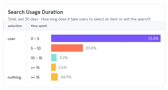
The image above shows that, in the last 30 days, a search result was selected within 0 to 5 seconds in 73.4% of instances. The next most common duration was 5-10 seconds, at 20.8%. Together, these account for 94.2% of searches, and the largest percentile corresponds to the shortest duration, so I consider this a positive outcome.
We also include a survey box in the app itself via Appcues. On a scale from 1-6, with one being the worst and six being the best, the new search functionality was well received with an average of 5.2 out of 6. Some quotes from participants:
I love this enhancement! This is very helpful when we work on reports.
and
I can speak to it as exciting to have such a great update.
Now let us look at the most interesting metric to me, performance. This graph is over a longer period than the legacy one, two weeks instead of just one.

| Legacy | New | |
|---|---|---|
| min | 158.21ms | 3.25ms |
| avg | 562.47ms | 17.11ms |
| max | 9,950.00ms | 121.13ms |
The difference is astounding across the board. On average, it is 30 times faster than the legacy implementation. The duration is also much more consistent across portals regardless of size and does not depend on network conditions, meaning that our largest portals see up to 80 times the performance improvement, perhaps even more.
This validated the hypotheses I formed during project planning, so I was satisfied to see that my predictions came true. I closely monitored this metric following the formal release to make sure there were no exceptions and that everyone had a smooth experience. No surprises were found.
Conclusion
The biggest conclusion I want to draw attention to is that even though something may sound sub-optimal in theory and does not fit already established best practices, it does not mean that it will be in the real world when we factor in actual business variables and data.
A client-side approach like this would not work for most search functionality. This usually makes it more difficult to think outside the box and come up with alternative solutions. The nature of our problem was different, and we failed to recognize that as a team in our first discussions about the project. Thankfully, we recognized it before investing significant effort.
Another success of the process was writing down the questions and concerns we had about the approach, then answering them experimentally with real data and low-effort proofs of concept early in the project. This gave us the confidence we needed before formally committing to technical decisions and, above all, real rather than theoretical arguments to back up those decisions. This was not something our team was used to doing, and we had paid a high price for that in the past.
For completeness’ sake, the repository below is an oversimplified visual representation of what I built. It lacks many of the details described in the post and others that I did not mention. For instance, it searches only one entity type, users; does not rely on Web Workers; omits much of the code we included to gather metrics; and has no automated tests.